Friday, 24 October 2014

Rob Draper - Illustrator


Rob Draper is a freelance illustrator and letterer who illustrates on everyday objects, my favourites of his work are the coffee cups and five pound notes. 


Typography Research - A Love Letter to the City - Steven Powers

A Love Letter to the City - Steven Powers

Linking from the last post I made about art in the city, from that I then started to research more thoroughly into signage around streets and cities. An artist called Steve Powers who creates colourful and bold signage around cities, even in different countries such as Belfast, Dublin and Philadelphia. What I like about Power's work is that the pieces that he does and the colours that he uses are strong and they stand out and contrast from the city or space that they are in. 


'Anywhere is paradise with you' - Steven Powers

'Open your eyes I see the sunrise' - Steven Powers

'Euphoria is you for me' - Steven Powers

'Please play nice thank you' - Steven Powers

'Train to always' - Steven Powers


Photography in Sheffield

While out in sheffield I thought I would photography the bits of work that I would often see on a day to day basis, I liked these the most as some of them are by graffiti artists that I like the most and the others that I photographed are just pieces of work that I liked, some of them have typography in them and that's what I like about these pieces specifically. 

Sheffield Photography - David Attenborough 

Sheffield Photography - Stabby Women, kid Acne


Sheffield Photography - Kid Acne 

Sheffield Photography 

Sheffield Photography - 'You'll thank me one day', Kid Acne

Sheffield photography 

Sheffield Photography 

Sheffield Photography 

Sheffield photography - Kid Acne 

Sheffield Photography - Kid Acne 

Sheffield Photography - Kid Acne 


The Taste Gap - Ira Glass

The Taste Gap: Ira Glass on the secret of creative success, animated in Living typography.


I came across this video by Ira Glass called 'The Gap', the video portrays a meaningful message to the audience about how to get better at what you like and how you can do it, essentially it's the secret of creative success. I personally think the message in this video is important, it tells you that you can't give up and you need to stick at it to get where you want to be in life which is essentially true, I think the video is well made and connects with the viewers especially people in the art industry. I also like how the typography visually connects with what it says such as: 


Oliver Jeffers - Typography

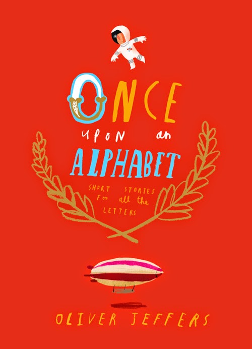
While researching typography I came across an artist called Oliver Jeffers and took an interest in his illustrated book called 'Once upon an alphabet'. I thought this would be useful research as I'm looking at lettering and thought it could be a kind of food for thought piece of work. I really like the lettering that he's created in this book along with the quirky illustrations he's done along with the lettering, the colours that he used to make the message come across about what each letter stands for shows really well and communicates with the audience. 


Friday, 17 October 2014

Jonathan Barnbrook - Graphic Design, Film Maker and Typography

  1. Jonathan Barnbrook is a British artist who creates work in a variety of work stations such as graphic design, film making and typography.

    I like the overall look of Barnbrooks work because of the use of simple and selected colours the font for the work also works well with the contrasting colours and where the text is placed. 


Mimmo Rotella & Wolf Vostell - Artist research

While searching for more artist reference that related to my city in flux work I came across two artists who specialised in collage, Mimmo Rotella and Wolf Vostell.

Mimmo Rotella was an Italian collage artist and was best known for his decollage work which were made from advertising posters, I like the work that he creates from using this technique, especially the block colours and worn finished look from the finished outcome. I also love the typography in the work, the different styles and ripped text really stands out to me and i think it adds to the overall look of the work and it's what I love most about Rotellas work. 


Wolf Vostell was a German artist who specialised in painting and sculpting, he's known as one of the first artists to start experimenting with art including videos and installation pieces, he's also known for his creative decollage work. What I like about Vostells work is that you can see how many layers they are and how rough he goes about creating his decollage pieces, the bold colours, pieces of text and how new images are created from combining other pieces of work.  


Collage and Decollage is something that I take a big interest in and will probably use these techniques and processes in my work later on in the project so I thought they would be good to include. I also think they link to my city in flux project theme well.